As an illustration student, who specialises in lettering and typography, it was an obvious choice to visit Jenny Holzer’s exhibition that was being held in the Tate Modern. I had never seen her work in person before, so you could say I was excited, as she is one of my favourite typographers. She quoted; ‘I chose language because I wanted to offer content that people- not necessarily art people- could understand.’ This quote, really resonated with me because, this is exactly the outlook I take when making my own work. Using text is a way of creating a message for people to read directly, instead of searching through an image, to find a hidden meaning.
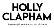
As soon as you entered the exhibition space, you were hit by four walls covered in typographic prints, as well as a glass box, featuring a set of 600 hand illustrated images. These prints and objects were part of her series called Truisms. Truisms such as men don’t protect you anymore, and you are trapped on Earth so you will explode, were printed on packs of condoms and polystyrene cups. It was interesting to see objects like these because I had never thought of ever printing text onto objects like these.
As you walked into another room, connected to the first, you were instantly hit by a huge, electronic roll of text, hanging from the ceiling. I found myself being immersed with the bright text being showcased above my head. This electronic piece was part of Holzer’s The Survival Series. ‘Each cautionary sentence instructs, informs, or questions the ways an individual responds to the political, social, physical, psychological and personal environments. ‘Protect me from what I want’ is a key Survival text.’ (Tate Modern, 2018) This room also featured a set of 13 plaques on one of the walls featuring quotes that were ‘the voices of the dead’. These pieces came from her series of art work called The Laments. The voices, were to convey the last thoughts of ten adults, two children and a small infant. The quotes represent the devastating and ‘unnecessary deaths’ caused by HIV related illness’. These plaques were made by carving the text onto thirteen stone sarcophagi.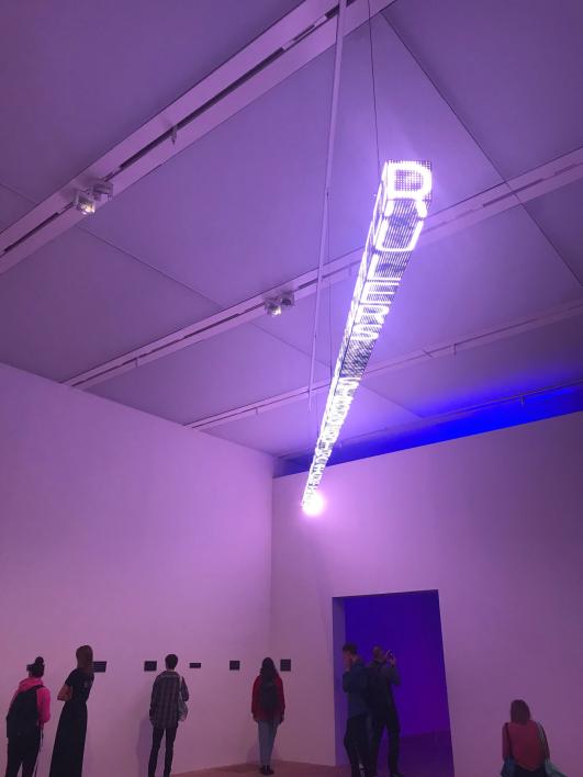
Finally, I entered my favourite room of the exhibition. The piece was titled; Blue Purple Tilt. It was my favourite because the colour of the lights were so vivid and breath- taking. The room was dark, but was illuminated in the centre of the room by electronic lights once again. However, the lights were leaning up against a wall unlike the previous lights that were hanging from the ceiling. The text that was rolling across the LED signs, were writings, from Truisms, Inflammatory Essays, Arno and Blue.

This was the piece that resonated with me the most, and has inspired me to start looking at text differently. I have only worked with 2D prints with my lettering on, however, I have now started to think that for my final year at university, I should challenge myself, and push myself out of my comfort zone. My first thought would be to experiment with 3D text, as I have never done so before. This means that I will need to spend lots of time perfecting the craft of 3D text making. Therefore, the next stage of my Self Initiated Project will be researching typographic sculptors, as well as experimenting with different 3D materials, in order to move my project to the next level.
